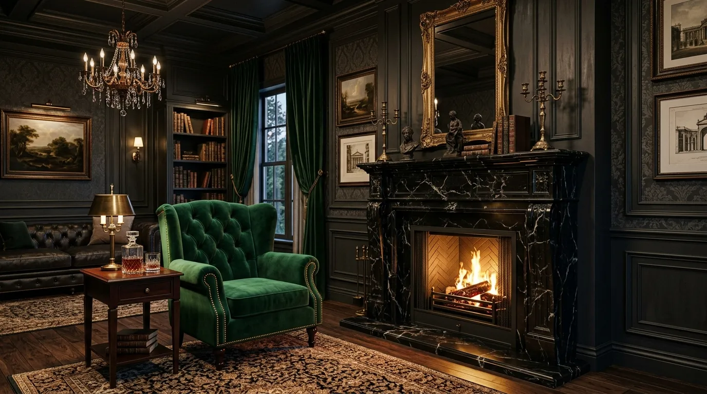
16 Dark Color Combinations That Make Interiors Feel Luxurious
Dark interiors have a reputation for feeling dramatic, but when the right shades are paired together, they can also feel incredibly warm, polished, and expensive. The secret is not simply choosing dark paint—it is creating contrast through color, texture, lighting, and carefully selected furnishings.
The right dark color combinations can transform an ordinary living room, bedroom, dining area, or home office into a space with depth and personality. Think charcoal with warm wood, deep green with brass, navy with creamy white, or chocolate brown with muted blush. These combinations create the layered look that makes a room feel intentionally designed rather than simply dark.
You also do not need a huge home or a luxury renovation budget to use these ideas. Renters can experiment with removable wallpaper, textiles, artwork, and furniture, while homeowners can take the look further with paint, cabinetry, lighting, and architectural details.
In this guide, you’ll find 16 sophisticated dark color combinations for interiors, along with practical ways to recreate each look. Whether you love modern, traditional, moody, Art Deco, contemporary, or cozy interiors, there is a palette here that can give your home a richer and more luxurious atmosphere.
Recommended Items for Your Home Decor
1. Charcoal + Caramel Brown

Charcoal and caramel create a sophisticated combination that feels especially inviting in living rooms, bedrooms, and cozy home offices. The cool depth of charcoal balances beautifully with the warmth of caramel leather and wood.
Try charcoal walls with a caramel sofa, leather accent chair, or upholstered ottoman. Add walnut furniture, cream-colored curtains, and a textured rug to keep the room from becoming visually heavy.
For accessories, look for aged bronze lighting, woven baskets, ceramic lamps, and warm-toned artwork. If painting an entire room charcoal feels too dramatic, use it on one accent wall instead.
Small-space tip: Keep the ceiling and larger window treatments lighter so the room still feels open.
2. Forest Green + Antique Brass

Deep forest green instantly gives a room a rich, enveloping character, while antique brass introduces warmth and a subtle decorative glow.
This pairing works particularly well in dining rooms, powder rooms, bedrooms, and libraries. Paint the walls a deep green and introduce brass through cabinet hardware, picture frames, sconces, curtain rods, or a statement mirror.
Balance the palette with natural materials such as oak, rattan, linen, and stone. Cream upholstery can also soften the combination.
For a more traditional look, use carved wood furniture and vintage-inspired lighting. For a contemporary interpretation, choose clean-lined furniture and simple brass accents.
Budget idea: Instead of replacing hardware throughout a room, update just one visible feature, such as cabinet pulls or a mirror frame.
3. Navy + Warm Cream

Deep navy paired with warm cream creates a timeless interior that feels polished without becoming overly dramatic. Unlike stark white, creamy tones make navy feel softer and more residential.
Use navy on walls, cabinetry, a sofa, or built-in shelving. Then introduce cream through upholstery, bedding, curtains, rugs, and decorative ceramics.
Brushed brass or aged bronze can add another layer of sophistication, while medium-toned wood keeps the room grounded.
This combination is especially useful for bedrooms because the deep blue creates a cozy backdrop without the intensity of black.
For renters: Bring in navy through curtains, a large rug, bedding, and artwork rather than paint.
4. Espresso Brown + Dusty Blush

Espresso brown and dusty blush offer a softer alternative to traditional black-and-pink interiors. The result is moody, elegant, and surprisingly warm.
Use espresso brown through wood furniture, cabinetry, leather seating, or an accent wall. Add dusty blush in upholstered chairs, pillows, bedding, artwork, or curtains.
The trick is choosing a muted blush rather than a bright bubblegum pink. Look for earthy, slightly grayish pinks that complement the richness of espresso.
Add natural linen, dark wood, and antique brass for a sophisticated finish.
This palette is particularly attractive in bedrooms and dressing areas where you want the atmosphere to feel intimate and refined.
5. Black + Warm Walnut

Black and walnut are an excellent choice when you want a modern room with warmth rather than a stark monochromatic appearance.
Use matte black for walls, shelving, cabinetry, or selected furniture pieces, then introduce walnut through a dining table, media console, bed frame, or sideboard.
Because both shades are visually strong, texture becomes important. Add boucle, linen, wool, leather, or woven materials to prevent the room from looking flat.
Warm lighting is also essential. Choose lamps with soft bulbs and shades that create a gentle glow rather than relying entirely on overhead lighting.
Design tip: Let walnut remain visible rather than covering everything in black. The natural grain gives the palette much-needed visual warmth.
6. Deep Plum + Soft Taupe

Deep plum brings a luxurious jewel-tone quality to interiors, while taupe keeps the overall palette sophisticated and livable.
This combination can work beautifully in bedrooms, formal living rooms, and reading corners. Use plum on an accent wall or through a velvet sofa, headboard, or curtains. Introduce taupe through upholstery, rugs, walls, and larger furniture pieces.
Complete the room with dark wood, antique brass, and warm ivory accents.
For a contemporary space, choose simple silhouettes and limit decorative accessories. For a more glamorous room, incorporate velvet, curved furniture, decorative mirrors, and softly aged metallic finishes.
7. Moody Blue + Cognac

Moody blue and cognac create an especially handsome palette without making a room feel overly masculine. The combination works because the deep blue provides visual depth while cognac introduces warmth.
Try a deep blue wall behind a cognac leather sofa or accent chair. Add walnut furniture, cream textiles, and aged metal details.
This palette works particularly well in home offices, living rooms, libraries, and media spaces. A patterned rug containing both blue and warm brown can help tie everything together.
If you have a small room, keep the ceiling lighter and use cognac selectively rather than filling the entire space with dark furniture.
8. Olive Green + Charcoal

Olive green and charcoal offer a grounded, earthy alternative to jewel-tone palettes. They feel modern but still connected to nature.
Use charcoal for walls, cabinetry, or large upholstered furniture and bring olive green through curtains, cushions, artwork, plants, or a statement chair.
Natural oak, stone, terracotta, and woven textures fit beautifully with this palette.
For a softer appearance, introduce warm beige or ivory. For something moodier, add black metal and dark wood.
This combination is especially effective in apartments because plants and natural textures prevent the darker colors from feeling too enclosed.
9. Burgundy + Muted Pink

Burgundy can make a room feel instantly richer, particularly when paired with a restrained dusty pink.
Instead of using burgundy everywhere, treat it as a focal color. A velvet sofa, accent wall, headboard, or pair of curtains can provide enough visual impact.
Balance it with muted pink upholstery, cream walls, natural wood, and antique brass.
Avoid highly saturated pink accessories because they can make the palette feel less sophisticated. Choose dusty, earthy, or slightly gray-based pinks instead.
For a budget-friendly update, experiment with burgundy throw pillows, blankets, artwork, and lampshades before committing to larger pieces.
10. Black + Ivory

Black and ivory is one of the easiest dark color combinations to adapt to different decorating styles. The contrast feels dramatic, but ivory is softer than pure white and therefore gives the room a warmer appearance.
Use black on doors, cabinetry, furniture, trim, or an accent wall. Layer ivory through sofas, curtains, rugs, bedding, and ceramics.
Add natural wood if the room feels too formal. Brass works well for a glamorous interior, while black metal keeps things modern.
The biggest mistake with this palette is using only flat black and ivory surfaces. Add texture through linen, boucle, wool, rattan, stone, and wood to make the contrast more interesting.
11. Deep Teal + Chocolate Brown

Deep teal and chocolate brown create a dramatic, cozy palette with a slightly vintage character.
Use teal on walls or cabinetry and introduce chocolate brown through leather seating, wood furniture, rugs, or accent pieces. Warm cream can be added in smaller doses to prevent the colors from becoming too dense.
This combination works especially well with vintage artwork, brass lamps, patterned textiles, and bookshelves.
In a bedroom, consider teal walls with a chocolate wood bed and cream bedding. In a living room, a teal accent wall behind a brown leather sofa can become the room’s defining feature.
12. Slate Blue + Sage Green

Slate blue and sage green are ideal if you want a dark, sophisticated room without relying on nearly-black shades.
Slate blue provides depth, while sage adds a muted natural quality. Use slate blue for cabinetry, walls, or large furniture and introduce sage through textiles and accessories.
Light oak, warm white, linen, and aged brass complement both colors beautifully.
This palette is particularly useful for kitchens and bathrooms where very dark colors can sometimes feel overwhelming. Slate cabinetry with sage accessories and warm wood details can create a layered, contemporary look.
13. Aubergine + Soft Gold

Aubergine is a rich purple-brown shade that can make interiors feel dramatic and luxurious without looking overly flashy. Pairing it with soft gold creates an elegant palette with subtle Art Deco influence.
Use aubergine on walls, curtains, a velvet headboard, or a statement chair. Then introduce gold sparingly through lighting, mirrors, hardware, and decorative objects.
The key is choosing brushed, aged, or softly finished gold instead of highly reflective yellow-gold everywhere.
Cream, taupe, and dark wood can provide additional balance.
Rental-friendly approach: Use aubergine in removable textiles and artwork while bringing in gold through lamps, frames, and small accessories.
14. Charcoal + Burnt Rust

Charcoal and burnt rust combine modern drama with earthy warmth. It is an excellent choice for people who want a dark interior that still feels comfortable and inviting.
Use charcoal as the foundation through walls, furniture, or cabinetry. Add rust-colored upholstery, pillows, blankets, artwork, or ceramics.
Natural wood is almost essential with this combination because it connects the cool charcoal to the warmth of the rust.
Terracotta, camel, cream, and aged bronze can be layered into the palette without overwhelming it.
For a subtle update, keep the room mostly neutral and introduce rust through just two or three larger accessories.
15. Midnight Blue + Cool Gray

Midnight blue and cool gray create a sleek, contemporary palette that works especially well in modern apartments and minimalist interiors.
Use midnight blue as the stronger accent through cabinetry, a sofa, an accent wall, or bedding. Then layer several shades of gray through rugs, upholstery, curtains, and accessories.
To keep the room from feeling cold, introduce warm wood or a small amount of cream.
Matte black hardware and streamlined lighting reinforce the modern aesthetic, while textured fabrics prevent the palette from appearing too sterile.
This combination is particularly effective in home offices because it provides visual depth without requiring lots of decorative color.
16. Black + Emerald Green

Black and emerald green create one of the most dramatic combinations in this collection. Emerald brings jewel-tone richness to black, making the overall room feel bold and sophisticated.
Use black as the structural color through walls, cabinetry, furniture, or trim. Then let emerald become the accent through velvet seating, curtains, cushions, artwork, or a statement headboard.
Gold or brass can be added in small amounts for additional warmth. Cream upholstery and natural wood can soften the contrast if necessary.
Because emerald is so visually powerful, you do not need much of it. One substantial emerald element can have more impact than a room filled with small green accessories.
Frequently Asked Questions
What are the best dark color combinations for a living room?
Charcoal with caramel, navy with cream, black with walnut, and moody blue with cognac are versatile choices for living rooms. The best palette depends on whether you want the space to feel warm, modern, classic, or dramatic.
Do dark colors make a small room look smaller?
They can make walls visually recede, but the effect depends on lighting, contrast, furniture scale, and how the colors are used. A dark room with good lighting, lighter textiles, and reflective surfaces can still feel comfortable and intentional.
How can I use dark colors in a rental?
Focus on elements that can move with you. Try dark curtains, rugs, bedding, artwork, removable wallpaper, accent furniture, lamps, and decorative accessories instead of permanently changing the walls.
What colors make dark interiors feel warmer?
Warm cream, caramel, cognac, walnut, rust, terracotta, blush, and natural wood tones can all soften a dark palette. Warm lighting also makes a major difference.
Should all the furniture match the dark color scheme?
No. In fact, mixing materials and tones usually creates a more sophisticated result. Pair dark upholstery with natural wood, warm metals, woven materials, glass, stone, or lighter textiles.
How do I decorate a room with too many dark colors?
Introduce a lighter supporting shade through curtains, rugs, bedding, upholstery, or artwork. You can also add mirrors and layered lighting to create more visual openness.
What finishes work best with dark interior colors?
Matte finishes create a modern, understated appearance, while velvet, leather, polished stone, aged brass, glass, and natural wood add depth. Mixing finishes is often more effective than using one finish throughout the room.
Conclusion
Dark interiors do not have to feel gloomy or intimidating. When thoughtfully layered, the right dark color combinations can make a home feel intimate, sophisticated, and full of character. The most successful spaces usually balance deep shades with warmer materials, lighter supporting tones, interesting textures, and carefully placed lighting.
You also do not need to redesign an entire room to experiment with the look. Start with one strong element—a charcoal wall, emerald chair, navy sofa, aubergine curtain, or dark wood table—and build the palette around it. From there, introduce complementary colors through smaller pieces such as rugs, pillows, artwork, lamps, and decorative objects.
Most importantly, think beyond color alone. Materials, finishes, natural light, furniture proportions, and texture all influence how a dark palette feels. Whether you’re decorating a compact apartment, refreshing a rental, or designing a full-size home, these combinations give you plenty of ways to create a darker interior that still feels warm, balanced, and distinctly your own.


