18 Paint Color Pairings That Make Any Room Look High-End
Quick answer: The paint combinations that make a room feel expensive share a common thread: deep, grounding tones paired with warm neutrals, soft metallics, or a single confident accent. Pairings like charcoal and cream, terracotta and sage, or navy and brass create depth and contrast without feeling busy. The goal is tonal balance, not more color.
Walk into any high-end hotel lobby or a friend’s recently renovated living room, and you’ll notice something: the walls rarely rely on a single shade. It’s the pairing, the contrast between a deep base and a soft complement, that gives a space its polish. You don’t need an interior designer’s budget to achieve that look. You need the right two (or three) colors working together.
Below are 18 paint color combinations that consistently read as elevated, whether you’re refreshing a bedroom, a kitchen, or a hallway. Each one is a starting point for your own home decor project, not a strict formula.
Recommended Items for Your Home Decor
1. Charcoal Gray and Warm Cream

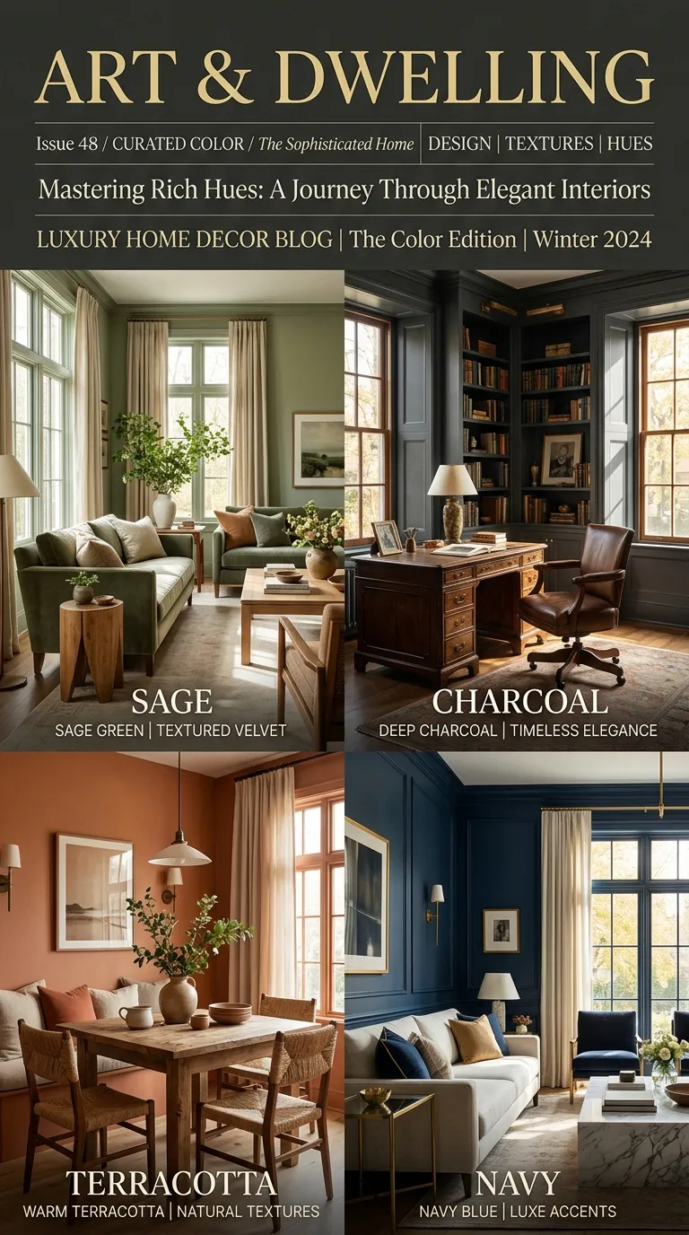
Charcoal walls paired with cream trim and ceilings create instant sophistication. The dark base adds weight and drama, while the cream keeps the room from feeling heavy or cave-like. This combination works especially well in living rooms with good natural light.
2. Terracotta and Sage Green

Earthy and grounded, terracotta walls with sage green cabinetry or trim feel collected rather than trendy. Both colors are muted enough to avoid clashing, and together they bring a sun-warmed, Mediterranean quality to kitchens and dining spaces.
3. Navy Blue and Brass

Navy is one of the most reliably luxurious wall colors, and pairing it with brass hardware, light fixtures, or picture frames pushes it further into “expensive” territory. Use navy on a single accent wall if full commitment feels like too much.
4. Soft Blush and Greige

Blush walls can read as sweet rather than sophisticated unless you temper them. Pairing blush with greige (a gray-beige hybrid) softens the pink and grounds it in neutral territory, making it suitable for bedrooms and powder rooms alike.
5. Deep Olive and Ivory

Olive green has quietly become a go-to neutral for designers. Combined with ivory trim, it feels organic and timeless rather than trendy, and it photographs beautifully against natural wood furniture.
6. Black and Natural Wood Tones

Matte black walls paired with unfinished or lightly stained wood create a striking, gallery-like contrast. This pairing works particularly well in entryways or home offices where you want a bold first impression. For more ways to let wood do the heavy lifting in a space, see these Warm Wood Interior Ideas to Make Your Modern Home Feel Cozy.
7. Dusty Blue and White Oak

Dusty blue has a calming, almost coastal quality. Paired with white oak flooring or furniture, it avoids feeling cold, instead landing somewhere between serene and refined.
8. Mustard Yellow and Charcoal

Mustard can feel dated on its own, but set against charcoal trim or furniture, it reads as confident rather than retro. This combination suits accent walls in study rooms or reading nooks.
9. Aubergine and Dove Gray

Deep purple is an underused wall color that signals real confidence. Paired with a soft dove gray, aubergine feels moody without tipping into gothic. If you’re drawn to this palette, you’ll find more direction in these decor ideas for layering rich tones with softer textures.
10. Forest Green and Cream Trim

Forest green walls with crisp cream trim create a classic, almost library-like atmosphere. It’s a combination that ages well and rarely needs updating, which is part of why it reads as expensive.
11. Warm Taupe and Off-White

Taupe is the quiet achiever of paint colors. Combined with off-white (not stark white), it builds a soft, layered neutral palette that works in nearly every room without competing with furniture or art.
12. Burnt Orange and Deep Brown

This pairing leans into autumnal warmth year-round. Burnt orange walls with deep brown furniture or trim create a cocooning, restaurant-like coziness that feels intentional rather than accidental.
13. Slate Blue and Warm White

Slate blue sits between gray and navy, giving it versatility. Paired with warm white trim, it feels fresh and tailored, especially in bedrooms where you want calm without starkness.
14. Rust and Camel

Rust walls paired with camel-toned furniture or linens create a rich, leather-and-suede kind of warmth. This combination is particularly effective in living rooms built around a fireplace.
15. Deep Teal and Gold Accents

Teal has the saturation of navy with a touch more personality. Add gold picture frames, lamps, or hardware, and the room takes on a boutique-hotel feel instantly.
16. Soft Gray-Green and Walnut

Gray-green walls paired with walnut furniture split the difference between cool and warm tones, which is exactly why the combination feels so polished. It’s a favorite in contemporary dining rooms.
17. Deep Plum and Blush Pink

For a bedroom or powder room, deep plum walls with blush pink textiles create a jewel-toned richness. The key is letting plum dominate and using blush sparingly, in pillows or a single chair.
18. Pure White and Natural Linen

Sometimes the most expensive-looking rooms use the least color. Crisp white walls paired with natural linen textiles rely entirely on texture for interest. If you want to bring this palette to the table, these Warm and Inviting Table Decor Ideas show how to layer linen and neutral tones without the space feeling bare.
Tips for Choosing the Right Combination
Picking a pairing from this list is only half the work. Before you commit to a gallon of paint, test your chosen combination on an actual wall, in actual daylight. Colors shift dramatically depending on the direction your windows face and the artificial lighting you use at night.
It also helps to look beyond the walls themselves. The Hidden Design Secrets Professional Stylists Swear By explains how proportion, texture, and lighting work alongside color to make a space feel finished. Paint sets the tone, but furniture, trim, and accessories carry it through.
If you’re decorating for a specific season, pairing a timeless palette with seasonal textiles is an easy way to keep things current. These Charming Winter Farmhouse Decor Ideas are a good example of how neutral walls can flex with the time of year without a full repaint. And if you’re feeling adventurous, consider taking one of these pairings beyond a flat wall with one of these Vibrant DIY Wall Murals.
Bringing It All Together
A room doesn’t need five colors to feel expensive. It needs the right two working in balance, one grounding the space and the other lifting it. Whether you gravitate toward charcoal and cream or terracotta and sage, the principle stays the same: contrast with intention, not excess.
Start with one room. Pick a pairing from this list, sample it on your walls, and live with it for a few days before committing. The right combination won’t just change how a room looks. It will change how it feels to walk into it every day.
FAQs
What paint colors make a room look more expensive?
Deep, saturated tones like charcoal, navy, and forest green tend to read as expensive, especially when paired with warm neutrals or metallic accents. The contrast between a bold base and a softer complement is what creates a polished, high-end look.
Should I use dark or light colors to make a small room feel bigger?
Light, warm neutrals like cream or soft taupe generally make small rooms feel more open. That said, a dark accent wall can add depth to a small room without shrinking it, as long as the rest of the palette stays light.
How many colors should I use in one room?
Two to three colors is usually the sweet spot: one dominant wall color, one supporting neutral, and an optional accent. More than three colors can start to feel disjointed unless they’re carefully coordinated.
Do matte or glossy finishes affect how expensive a color looks?
Yes. Matte and eggshell finishes tend to look more sophisticated on walls, while a satin or semi-gloss finish on trim adds a subtle, tailored contrast. High-gloss finishes can look luxurious in small doses but overwhelming on large surfaces.
Can I test these combinations before committing to a full room?
Always test a sample patch on your actual wall and observe it across different times of day. Paint can shift noticeably under morning light, afternoon sun, and evening lamplight, so a swatch that looks perfect at noon might read differently by dinner.


